
The UltraKill Logo: Design & Meaning
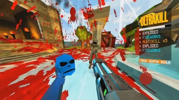
The UltraKill logo is a striking visual symbol that immediately communicates the game's core identity: relentless speed and brutal combat. The logo features sharp, angular letterforms rendered in a bold sans-serif typeface with a distinctive red and white color scheme that mirrors the game's intense action-focused aesthetic. This design choice isn't accidental. It reflects UltraKill's position as a high-octane action game where every second counts and every movement matters.
The angular, geometric nature of the logo reinforces the game's emphasis on precision and momentum. Unlike softer, rounded typography that might suggest accessibility or casual gameplay, UltraKill's sharp edges communicate aggression and technical difficulty. The red coloring evokes both danger and energy, fitting for a game centered on eliminating enemies with maximum efficiency. This visual branding extends throughout the game's interface and marketing materials, creating a cohesive identity that hardcore action game fans immediately recognize.
Logo evolution and recognition
When UltraKill first launched, its branding had to stand out in a crowded space of action-focused games. The logo accomplishes this through bold contrast and memorable simplicity. The letterforms are distinctive enough to remain recognizable even when scaled down to small icon sizes, which is essential for modern gaming where a logo appears across web browsers, social media, and in-game menus.
The red and white palette connects visually to the game's HUD and overall color language. Players accustomed to UltraKill's interface recognize these colors as signals of intensity and action. This consistency between branding and gameplay experience strengthens player recognition and emotional attachment to the game's identity.
The logo's role in game identity
A game's logo is often the first visual touchpoint players encounter. For UltraKill, the logo sets expectations accurately. It promises a game that's serious, demanding, and unapologetically focused on combat mechanics rather than story or character development. When you see the UltraKill logo, you know what you're getting: fast-paced action with technical skill requirements.
The typography choice reflects the game's target audience. Players seeking brutal, skill-based action games gravitate toward games with angular, aggressive branding. The logo filters audience expectations before they even press play. This kind of visual communication is why the logo works so effectively for the game's positioning.
Playing and recognizing UltraKill
If you're exploring UltraKill's visual language, the best approach is hands-on experience. Play UltraKill free on Dubdoo and observe how the logo's aesthetic carries through the entire game experience. From the moment you load the game, you'll see how the sharp, high-contrast design philosophy extends from the branding into the UI, enemy designs, and weapon effects.
The logo also appears consistently across Dubdoo's Action Games category alongside similar high-intensity titles. Recognizing logos helps you quickly identify the game style you want to play. Whether you're comparing UltraKill to other action games or searching specifically for this title, the distinctive logo makes it impossible to confuse with anything else.
Why logo design matters in browser games
Browser games face unique challenges in capturing attention. Players encounter dozens of games in scrolling menus and search results. A strong logo communicates game identity instantly, allowing players to recognize a game they've heard about or remember playing. UltraKill's logo accomplishes this because it's bold, consistent, and thematically aligned with the gameplay experience.
The logo also serves practical functions. It appears in browser tabs, social media thumbnails, and game reviews. A well-designed logo ensures the game remains visually distinctive across all these contexts. This matters especially for free-to-play browser games competing for attention without paid marketing budgets.
FAQ
What colors does the UltraKill logo use?
The UltraKill logo primarily features red and white, with a bold, angular sans-serif typeface. These colors reflect the game's high-intensity action focus and appear consistently throughout the game's interface.
Is the UltraKill logo trademarked?
The UltraKill branding, including its logo, is a trademark of the game's developer. This protects the visual identity and prevents unauthorized use of the logo in marketing or merchandise.
Can I use the UltraKill logo in my own projects?
You should not use the official UltraKill logo without permission from the developers. Using trademarked branding without authorization can result in takedown notices or legal issues. If you want to reference the game, use descriptive text instead.
Where can I see the UltraKill logo in high quality?
The official UltraKill logo appears on the game's official website, social media channels, and the Dubdoo game page. These sources provide official, authorized versions of the branding at various sizes.